Moving (but not shaking)
by chuckofish
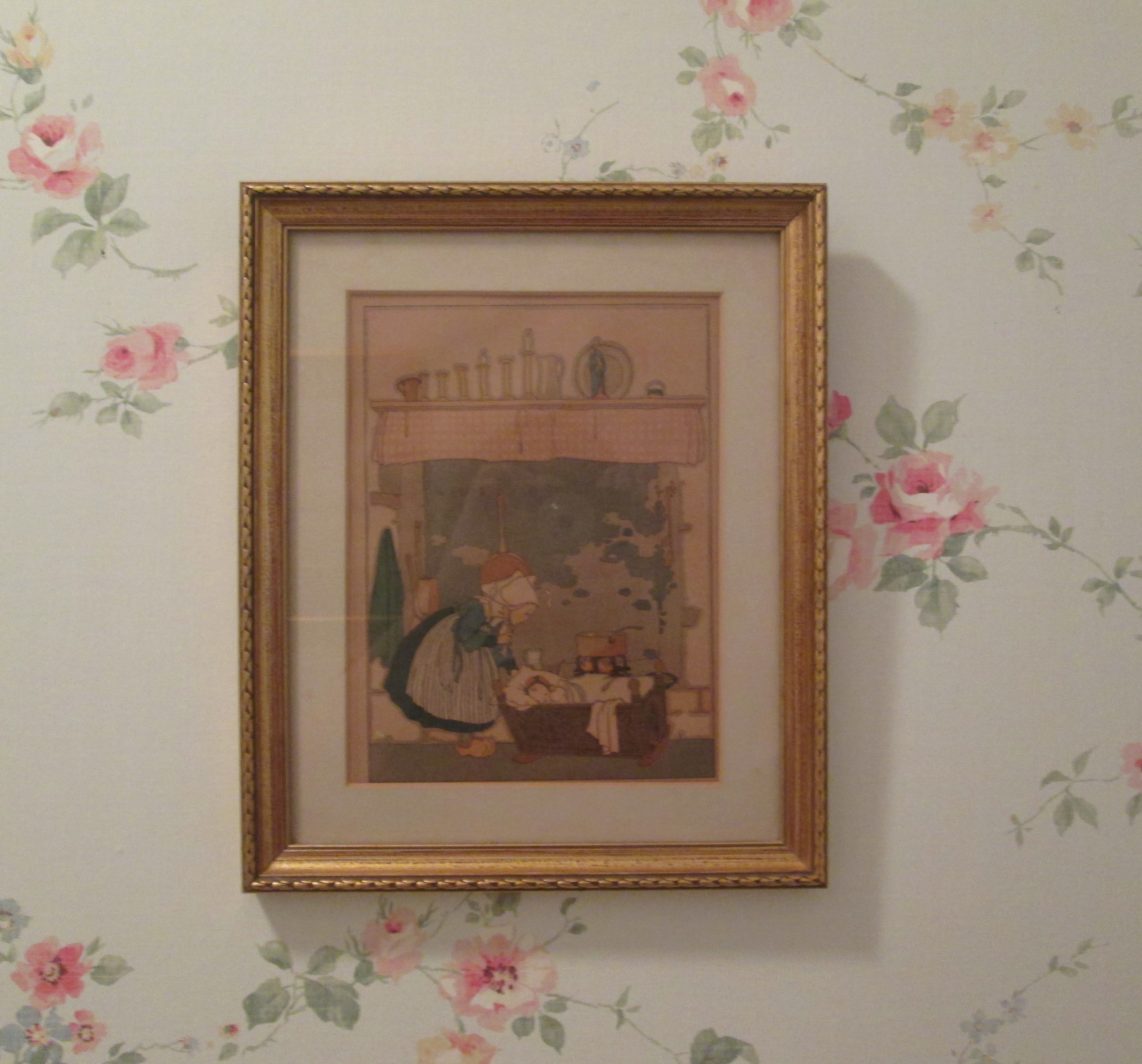
Inspired by my recent sojourn at my DP’s beautiful house, I finally put a couple of things up on my bare kitchen walls. The behemoth size of our new microwave required me to rethink the space above it, where the old shelves would no longer fit. I looked for new ones, but after months of fruitless searching I decided to nick the little shelves from the downstairs powder room. I replaced them with this sweet Dutch print that had been one of our mother’s favorites.
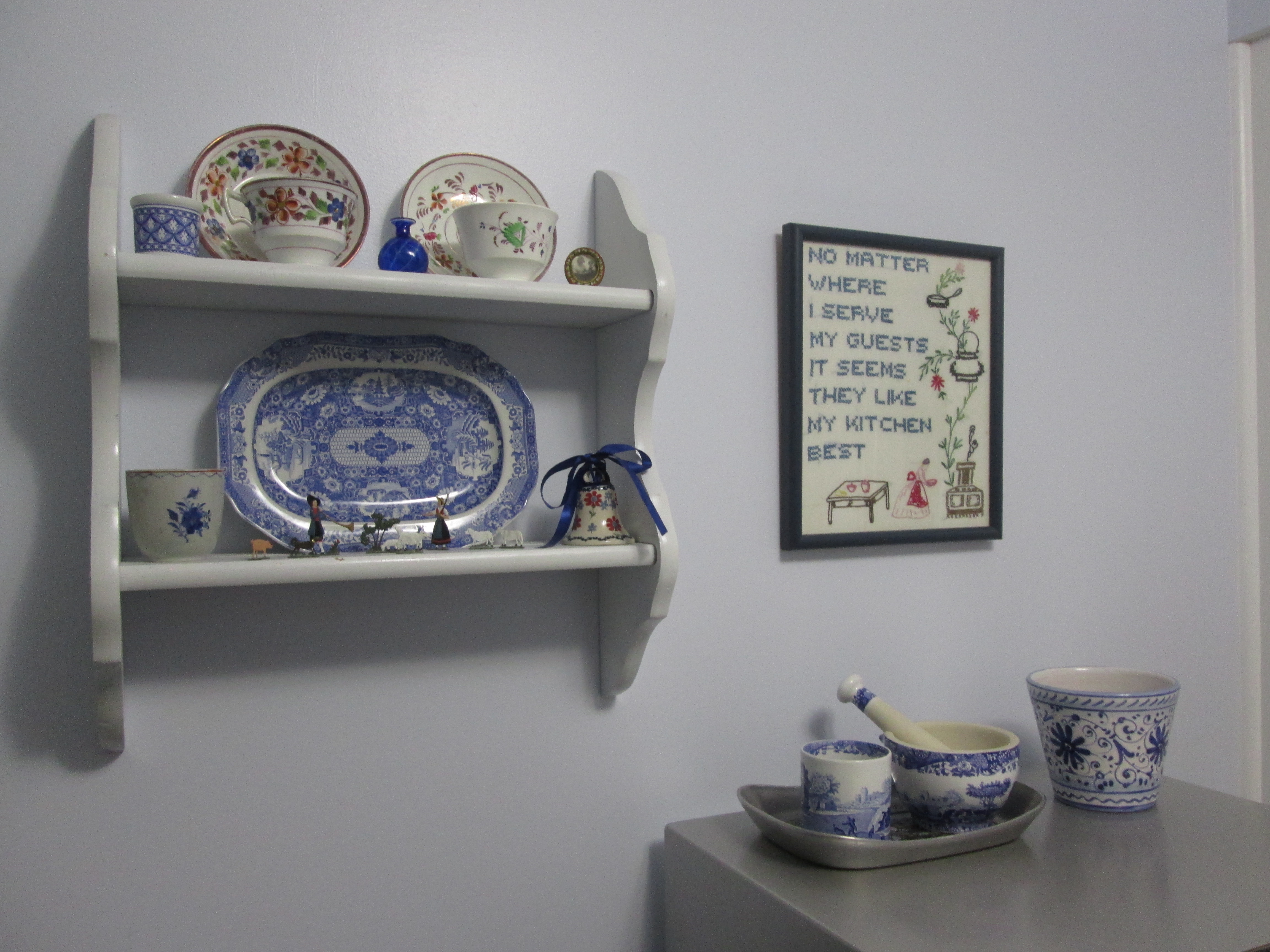
The print seems happy in that spot, and the smaller shelves fit perfectly in the kitchen next to the vintage embroidery that my DP gave me.
Here’s a slightly wider view — you can see what I mean about the microwave.
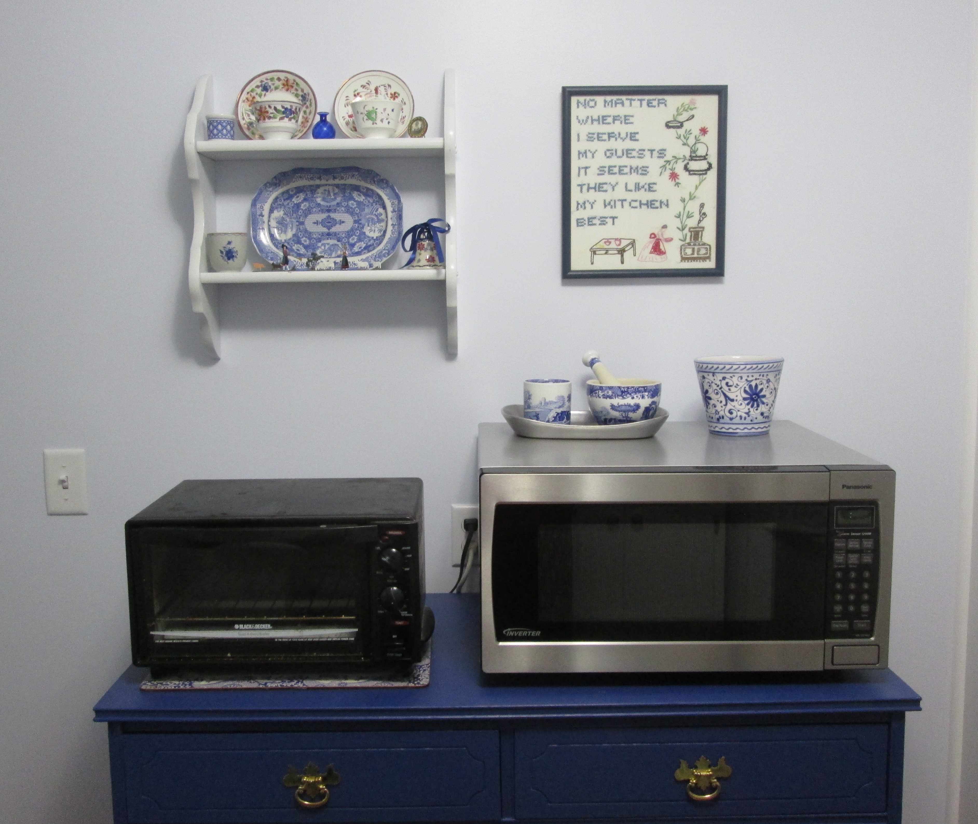
I think it turned out well — the shelves aren’t even crooked!
Curtains are next on my finishing list but choosing them is much more difficult than I anticipated. There is so much gorgeous blue and white material out there:
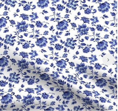
Fleur de Provence from Spoonflower.com
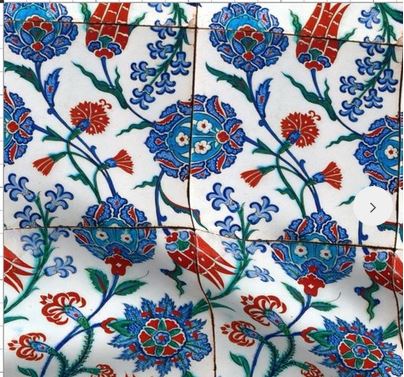
Unfortunately, my kitchen really cries out for a dash of color other than cobalt blue. This lovely design — also from Spoonflower — would be my curtain choice were it not for the fake tile lines. Do you think they would look okay on curtains or would the lines ruin the effect?
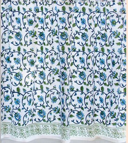
At the moment I’m leaning toward Saffron Marigold’s Moonlit Taj, although I’m a little worried that the blue will be too turquoise and clash with all the Spode in the kitchen.
What do you think? Would you choose one of the three? If so, which one? Should I keep looking? Don’t be shy or worry that I will choose the one you advise me against. I value any and all input! Have a lovely week!!

Lovely!
I agree about the faux tile lines on the fabric–it ruins the effect of the pretty pattern!
You can probably get a sample from Saffron Marigold. Then you will know for sure about clashing. But I wouldn’t worry about it–love the block print. Everything looks great!!
I like the idea of a pop of red!